|
|
Personal Projects
|
|
|
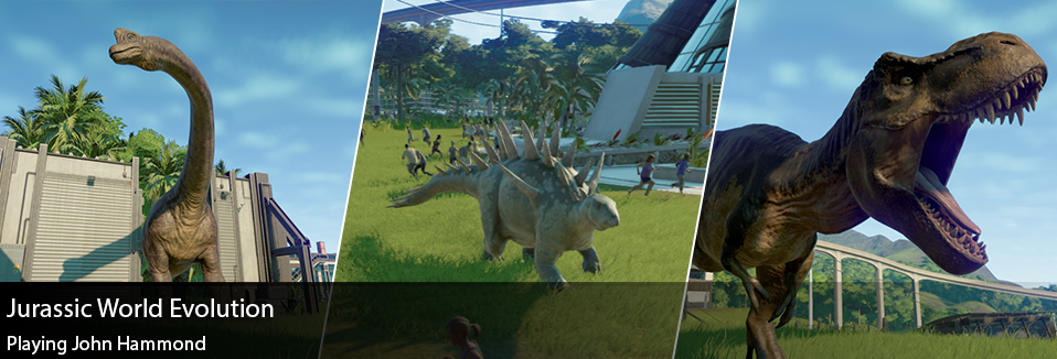
I feel like I’ve had a complicated relationship with “Jurassic Park.” Growing up I loved the movies, had all the toys, etc… Yet after working with the franchise during my tenure at Ludia, I sort of fell out of love with it. Jurassic Park started to become less about everything the movies stood for, and I started to associate it more with my experiences with that project and team. While listening to “My Favorite Murder,” a true crime comedy podcast, I got turned onto a new podcast by Steven Ray Morris called “See Jurassic Right.” Let me start by saying that it’s a pretty cheesy podcast, and I could easily see people not being into it… Yet I got sucked in and began to remember my love for the franchise all over again. In preparation for the next movie, I decided to jump on board and play Jurassic World Evolution. When I was first looking into the game, it was getting pretty mixed reviews… but I decided to get it anyways and honestly I’m not disappointed. In today’s post I’m going to be talking a bit about my experiences with the game, and what it’s like to play as John Hammond. Jurassic World Evolution is a pretty standard “theme park” sim game, with the added twist of maintaining and raising Dinosaurs. The game takes place on “Las Cinco Muertes” or “The Five Deaths,” an island chain introduced in the original Jurassic Park movie. Jurassic World Evolution does a great job at using this chain of islands as a sort of difficulty range and tutorial. As you progress through the different islands you’re introduced to new building and dinosaur types and challenges, as well as environmental factors like storms and diseases. There was one moment where my dinosaurs were coming down with a form of the Avian Flu, but I didn’t have the research to cure it yet… and money was tight. So I started air lifting the sick dinosaurs to a separate enclosure that was being built, to quarantine them. While stressed, I had to laugh at my suddenly dire strategy and hope all my dinosaurs didn’t die. Something Jurassic World Evolution does extremely well is, while the game has its own narrative, the game naturally enables players to work out their own stories. When asked about the game, I found myself explaining to friends just how fussy Ankylosauruses are and how it had caused a huge problem for me at first. The system the game creates can breath a life of its own, and at times “life finds a way…”
As soon as I made sure to have a few others around, they really proved easy to manage. Unlike the Dilophosaurus… those guys are just jerks. I had also made the mistake with my first Tyrannosaur thinking they would also be social creatures, thinking of the two T-Rexes in “The Lost World,” but I was sorely mistaken when I released two of them into the same area. I think it’s always the herbivores that shock me the most. I’m always paranoid about making sure the carnivores aren’t getting into trouble, so I typically forget about how the herbivores are doing, and suddenly they’ve busted out and are running down innocent park goers. Overall the system behind the dinosaur’s behavior makes it feel dynamic and allows you to feel like you “understand” the dinosaurs. When you’re not managing the needs of your Dinosaurs, it’s the Park’s Guests you’re trying to keep happy. Without people coming and spending money at your park, you have no revenu to build. Jurassic World Evolution does a great job at helping the player understand the needs of the guests. While you might have some great dinos, you may not have enough variety or not enough places to “view” these creatures. Guests have pretty standard needs like food, entertainment, and lodging. When building these types of commercial buildings, you’re actually able to micromanage them pretty heavily… setting how many people work there and even how much they sell “dino nuggets” for. It allows you to really dig deep into your park and determine how greedy you really want to be. There’s also three different divisions within your park giving you quests; Entertainment, Science, and Security. Increasing your “rep” with these divisions grant specific rewards for your park, either in specific bonuses or new buildings/Dino options. The only downside being that if you favor one division too heavily, it’ll negatively impact influence in another. I found this system to be pretty frustrating at times, for instance if the Security Division wants me to raise two dinosaurs… I don’t know why the Science group would become angry at me. That being said, balancing these relationships doesn’t seem too difficult thus far yet it’s something that keeps me paranoid. If one of the divisions becomes too “angry” with you, some of their personnel might attempt to sabotage your park. This is something I’ve only experienced once thus far in the game, and it’s rough… suddenly all of my Power Stations went down, and I had to send rangers out to fix them. From what I can tell there’s no real upgrades or systems you could build to really prevent human sabotage. Although the game may introduce more aspects to this later on, it definitely adds a layer of chaos and stress into the game. Just when you become cocky enough to think that you’ve built a park that would put John Hammond to shame, it could all go down with one “Dennis Nedry.” Overall I’ve been really enjoying the game, it’s fun to build your own theme park, release dinosaurs, etc. Although I do find it odd that the game has no “Day and Night” cycle… so much of the ambiance from the movies take place at night, and I could only imagine how cool my park might look all lite up… it just feels like an odd design decision. Also the game allows you to mess pretty heavily with dino DNA, but at the end of the day we can’t really create our own unique hybrids like the “Indominus Rex” from Jurassic World. While it’s fun to get different cosmetic options, I really want to see some changes when I add Shark DNA into something. There’s still a ton about the game I haven’t really dived into, but if you’ve made it this far and find yourself curious… I would just go pick up the game. Although the price tag is a bit higher than it probably should be, for what it is I’ve really enjoyed my time with it.
0 Comments
As I find myself in the hiring seat once more, and my inbox flooded with applications, I can’t help but think of a few more “Do’s and Don’ts” when it comes to applying for artist positions. I’m only just now realizing that I’m writing this on the anniversary of my first post on this topic from May 2017. Today I’ll be covering more of my recommendations and thoughts from the seat of a hiring manager.
You should also double check your URLs, I had more than one application with broken links.
“10+ years working as Illustrator and animator, I do it all the day!” Please do what you can to make your cover letter more informative and a tad more professional.
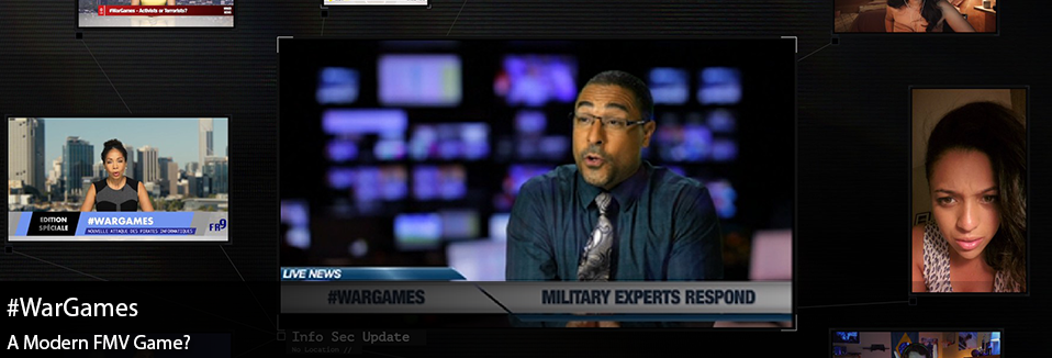
Alright I think that’ll end today’s rant! Hopefully this was helpful to some of you who are looking to apply at new positions. I may write another post soon from the position of the hiring manager, and some tips and tricks I’ve picked up along the way. In any case thanks again for reading! Have you ever played a Full Motion Video (FMV) Game? They were popularized in the mid-80’s, and featured pre-recorded video to showcase the action… rather than sprites, 3D models, etc. #WarGames, released March 14th 2018, feels like a modern spin on a FMV Game. From the creators of Her Story, a game I briefly discussed in an article about “Implied Knowledge," #WarGames presents itself as a tale of “Hacktivism” and political intrigue. Overall it feels very much like you’re watching an okay Netflix show play out in front of you, and you’re slightly engaging with the narrative. Today I’ll be talking more about my experiences with #WarGames and it’s unique take on an old formula. When #WarGames starts, it’s a bit difficult to understand what’s expected from you. You’re pretty immediately presented with different “screens” to view, as characters are chatting with one another. #WarGames does a clever thing where it will incorporate “FaceTime” style videos, with news broadcasts, websites, emails, etc. that all further the narrative in some way. These all run “live” with the story, and there’s really no pausing or hiccups to the story as it moves forward. A little detail that I loved was that whenever you hit the esc key to access the game’s menu, there was an estimate to how much longer the episode was...knowing that the story plays our linearly. The players can zoom in on the screens they find the most interesting as the story unfolds, meaning they could potentially “miss out” on things happening on another screen if they aren’t careful. I think that’s one of the most interesting elements to this game, at the end of the day it really doesn’t “expect” anything from the player. If you did nothing, the story would unfold in it’s own way… without you. Yet supposedly how you choose to look at screens, potentially by length of time or just by being on a certain screen at a specific timestamp, changes the course of the story. It’s definitely rare that you actually understand what “decision” you’re making in the game… there’s probably only one instances that I felt like I was consciously making a decision. In fact there were a few times I didn’t agree with the decisions the protagonist was making. To that end it’s best to play this game pretty passively and just observe the story in whatever way feels right. While I just argued that you should play this game “passively,” my main critique of this game would be that I never felt like an active participant in the story. Like Orwell, it was a bit too much of a voyeur experience for me. Instead of modifying the protagonist’s actions, via the screens I watch the most, I felt like I should almost be the one hacking the people I was watching. It would have potentially have been a more drawing narrative if the player/user was an active character and participant into the story. Instead it was very much like watching the lives of others unfold, in a way that felt like we were creeping in on their personal lives…. Which could make for its own creepy hacker narrative. Overall the narrative was pretty good, maybe with some over dramatic acting at times, but felt believable enough. #WarGames plays with the ideas of fake news, the military complex, and “hacktivism” in pretty interesting ways, but I’m not sure if the game is really making a statement on today’s political discourse. Now that I work at a Cybersecurity company, I can’t help but laugh about some of the ways they interpret “Hacking”… but #WarGames is a pretty entertaining experiment. If you’re curious, it’s definitely worth the $3 price tag on steam. Although I do think I was probably more drawn into the narrative from “Her Story,” but I think that’s just based on personal taste. In any case both of these games are super interesting, and are doing things that other games simply aren’t.
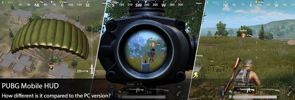
You can pick both of these titles up on Steam, thanks for reading! Okay so… I know I’ve been talking a lot about Playerunknown’s Battlegrounds, and if this is any indication I’ll likely continue this trend as long as this game evolves, releases new modes to play with, changes their UI, and drops alternative versions of itself… Specifically today we’ll be talking about the new Mobile PUBG that was released just this last month world wide! Honestly I typically have pretty low opinions of shooters on phones, so I was pretty hesitant to pick this up. Yet I have to say my first experiences into the game were pretty wonderful, and as ever I noticed a lot of changes to the HUD from the PC version. Today we’ll specifically be looking at and comparing the UI changes between the Mobile and PC version, and discussing why they might have made these kinds of changes. To start if you’re unfamiliar with my previous breakdown of PUBG’s UI changes, I’d encourage you to check out my previous post on the 1.0 update. Upon first glance of the Mobile HUD, it feels a bit odd to compare the two. There’s a ton of screen real estate that needs to be allocated for user controls and interactions on either side of the screen. Although we can start to pick up their strategy fairly quickly, in the past I’ve identified the Mini-Map and the “Team Info” as primary focus information needed for the player. While these elements have been moved down and to the sides on the PC version, in a sort of “bottom bar” area for all player important info, these same elements have actually been moved to the upper corners of the screen in the Mobile version. Doing so, frees up this info from being too covered up by the user’s hands as they try to utilize the thumb controls. Keeping the primary weapon/ability info at the bottom center still feels pretty right in this version, there's something about UI at the bottom that implies ownership to the player… like this is “my info.” Also the Objective Info and Player kills swapped sides of the screen to free up real estate for the mini-map placement, which seems to balance out the screen nicely. While on first glance I found the screen to be pretty cluttered on the mobile version, it’s really not too bad once you get into the game. Beyond different placement of UI elements into the game, what’s more revealing are the changes done to the individual elements. Since my last review of the PUBG hud, I’ve often complained about the extremely minor changes to the equipment icons when you pick up new items such as a helmet or a backpack. In the PC version there’s only a slight icon change, which makes it very hard to read if you’re using a level 1 or level 2 item… YET this is fixed on the Mobile version, by adding some simple iconography that indicates item levels. Also there’s a small gauge added to around the backpack icon that helps show the player how full their inventory is. Something else I noticed while reviewing these elements were that the Mobile version seemed to be much more interested in illustrating distances to the player. I noticed that in the teammate’s marker, the mini-map, and the compass now all show meter distances to objectives; something that isn’t done on the PC version. I find this sort of interesting, and a bit confusing… For me seeing how far I am away from the edge of the white circle might help, but teammate and objective distances feels like less of a concern for me. Yet it could be since I’m used to the PC version which doesn’t have this feature, and I’m used to just referencing the map or mini-map to get that info quickly. I also noticed on the compass that as you turn in the Mobile version, it doesn’t show you your direct heading like it does in the PC. Instead it prioritizes the latest marker placed on the map. This sort of impedes some of the basic communication elements you have while playing PUBG, you’re often telling your teammates where shots are being fired from, yet in the Mobile version at best you can say general heading… which may imply that accuracy is less important on the Mobile version where everything feels slightly condensed compared to the PC. After becoming so intimately familiar with the PUBG map on the PC version, it was very cool to see how well these environments were translated onto the Mobile game. Our favorite areas of the game, namely the “dorms” near the school, feel just as familiar and right as they do in the PC version. Yet there’s something “smaller” about the mobile version that I really couldn’t put my finger on. I do genuinely wonder if the world is ever so slightly smaller, perhaps we move just a little bit faster as well, all in an effort to encourage slightly smaller game times on the mobile version. Looking through youtube and reddit boards it’s very easy to find data on the PC version of the game, and more specifically how long it takes someone to run across the map. Yet there isn’t any real “data” out there yet on the Mobile version. The best way I had to compare was to start reviewing different “let’s play” videos of finished games, and compare average game lengths between the PC and the Mobile version. What I found is that the PC version is typically 30-35 minutes to a completed “win” game scenario, whereas the mobile version tends to run more like 20-25 minutes. Honestly I was expecting it to be more drastic than that, while playing on the mobile game everything felt much faster… yet this could just be a result of my familiarity to the PC version that made it feel THAT much faster. I’d be really curious to dig more into what strategies they used to accomplish this, is the island actually smaller? Is the circle a bit faster? Do we move at different speeds compared to the PC version? It’s likely a combination of strategies, and also a feeling emphasized by playing on a smaller handheld device. Whoever designed the controls and minor tweaks to the game’s interactions, did an excellent job. Not being a huge mobile shooter fan, I was at first confused with the duplicated shoot buttons on both the left and the right hand side of the screen. Until I wanted to either shoot and strafe or shoot and aim, using different thumbs to do so. These controls become extremely intuitive as you found yourself in a firefight. Unsure of how to change the fire mode? Maybe just tap the “single fire” button above your weapon. While I appreciate how easy it is to understand the different movement types (crouch, prone, stand, and jump), I couldn’t really see myself doing the same sort of vaulting maneuvers that I’ve become accustomed to in the PC version. For me it feels a bit hard to navigate with my thumbs, and instead of jumping over objects I found myself much more paranoid about just crouching or going prone. Which isn’t necessarily a bad thing, just an observation. The auto-sprint functionality works extremely well, noticing that as your drag your thumb forward there’s an indication to “lock” your sprint… once I discovered this, it made movement a lot easier. Finally the auto loot system really takes the stress out of the looting aspects of the game. I think in many ways it also helps speed up the gameplay, so much of my time on the PC version is spent looking at the ground and deciding what I want to pick up. Yet within the Mobile version it’s pretty quick and easy, at times I was slightly annoyed with an inventory window that wouldn't go away… but overall it feels really elegant and built towards player ease of use on a mobile platform.
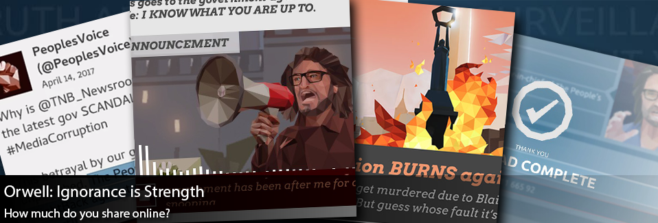
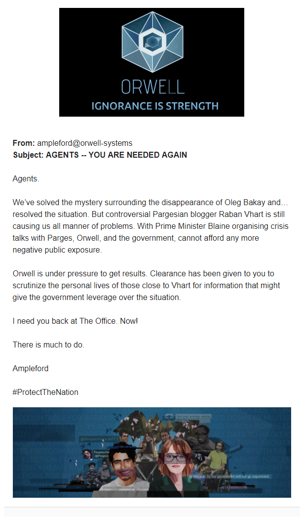
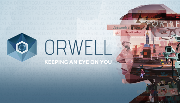
Overall I was very pleasantly surprised with the Mobile version of PUBG, granted my expectations were pretty low but I felt the same kinds of excitement that I feel while playing the PC version. I know there’s some speculation right now that much of the game might be filled with bots, which could account for my very first match resulting in a chicken dinner… yet for me this really didn’t lessen my enjoyment of it. I’m not sure how much time I’ll devote to the mobile version, just because I don’t play too much on my phone… Yet it’s sort of fun knowing that I can. They’ve done quite a few typical mobile gaming tricks to bring people back, i.e. daily rewards… etc that if they added to the PC version, you’d likely see me being more vigilant about logging in. There’s also a “Missions” and “Events” system introduced here, that I think are also interesting rewarding mechanics that should probably be introduced into the PC version as well. These sorts of “carrots” are typically associated with just mobile games, yet could bring a lot of life back into the PC version. As much fun as a random crate is every once in a while… the PC version could use more rewards to keep players engaged, even if they aren’t having good matches. In any case I imagine we could start seeing this sort of cross pollination between different versions of the game, as it’s obvious to see different teams working with the franchise, and they can easily see what works and what doesn’t cross platform. How much do you share online? What opinions, links, hashtags do you share on facebook or twitter? Do you ever wonder if a case could be built against you using what you share? A profile curated based off of comments on message boards, dating websites, or personal blogs. Orwell : Ignorance is Strength asks the players to do just that in the name of a dystopian government called “The Nation.” Plagued with conspiracy, terrorist bombings, and insurrection, The Nation is attempting to use this new security monitoring technology called “Orwell.” In Orwell agents can monitor social media traffic, personal correspondence, and even access personal devices to curate profiles and gather information on specific targets. Picking and choosing what information to add to the database, determines how a target is either prosecuted or pardoned by the government/narrative. Today I’m going to be doing a brief review of Orwell : Ignorance is Strength, a game that’s releasing episodically over the next couple weeks… so these impressions will only be based off of the first few episodes of the game.
Once you’re in, it’s pretty easy to pick up the mechanics of this game. As you explore different fake websites and profiles, information snippets are highlighted for you and you can choose to drag and drop them into the profile as you see fit. I’m not sure if this was in the first Orwell game, but there’s an added sense of hesitation with each snippet as it “takes time to load” into the Orwell servers. SO anytime you bring new information in, you can see the ingame clock go ahead an additional 10 minutes. Doing so adds a real sense of urgency and hesitation with each bit of information… for me it had me often wondering if I needed to add a new photo for a profile, or search more deeply for meaty information to upload. Often there is conflicting opinions and you need to pick and choose which you chose to believe is the correct one, OR pull out a snippet that could be out of context. Something someone might say on twitter might be much more inflammatory than what they confide in with a friend. This game does shine with the amount of depth into fake profiles, web pages, etc to explore and choose from…. YET it does expect a ton of reading on the player, and with the snippets becoming highlighted as you go through a web page… it’s very easy to get into the habit of just skimming and looking for the highlights. There are new types of areas that allows the user to “search” but only searching by dragging and dropping info segments, which again could be more interesting if the player was allowed to type into those fields. Sometimes it’s also pretty difficult to know what might prompt the next narrative piece, I’ve often found myself a bit stuck where I’ve reviewed every document I have open to me and yet each of the segments I could “collect” feel unimportant… and in an game where every collection is meant to feel like a decision, it feels sloppy to have moments where I’m just guessing. At the end of the day Orwell : Ignorance is Strength is more of an interesting puzzle game than a commentary on current events. That being said I still think there’s so much that Orwell is doing right, that I’d love to see translated into other games in the future. I felt so engaged in the investigative aspects of the game, the mechanics of searching social media, etc but I still found myself pretty disconnected from the story overall and the over dramatized acting really took me out of the experience. From a plot perspective I was much more drawn in by games like Mr. Robot, which actually featured much less from a narrative point of than Orwell… yet each piece was so incredibly well written and executed. While this might sound like a pretty negative review for Orwell, it’s more that I just wanted more from the game and had higher expectations of it being the second installment… YET I think it’s something really worth playing and experiencing on your own, as it’s definitely doing things differently than a lot of other stuff out there. Orwell: Ignorance is Strength is out on steam, be sure to check it out as they release their final episodes!
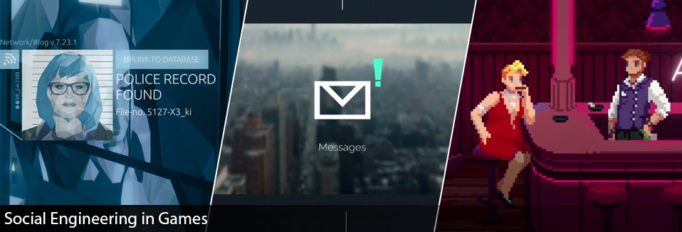
Social Engineering has been a “buzz word” floating around different gaming titles for a while now, but what is it really? Are games actually leveraging these Social Engineering techniques in interesting ways? Or are they merely piggybacking on these concepts to further their game’s narrative? Today I plan on exploring what Social Engineering truly means and ways we’re exploring these ideas in gaming! For this we’ll be taking a closer look at Orwell, Mr. Robot:1.51exfiltrati0n.ipa, and The Red Strings Club.
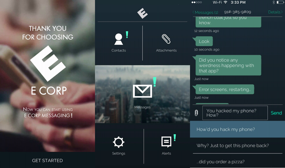
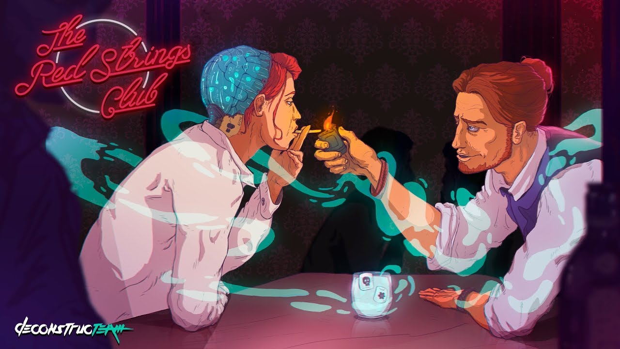
One of the first games that came to mind was Orwell. The premise of Orwell is that you’re a recruit trying out a new type of surveillance software called Orwell. Your job is to use Orwell to investigate suspects of a terrorist bombings in a place called “The Nation.” Orwell allows you to snoop on these individuals, find data fragments, and add these to the suspect’s file. The key point of the game is that you can choose what elements you add to the file, and what to not include. There are times where pieces of information could be out of context and paint the individual in a false light. The main way Orwell allows the players to gather this information is either through web based searches (finding user profiles and social media), listening in to phone calls and chat logs, and in some cases you’re able to hack into their phones and computer files. The depth of the “fake internet” is what makes Orwell so interesting, it feels very similar to searching on the web, social media accounts, the writings is well done and the chat logs feel realistic, and overall feels like normal web activity. It leverages what we already know of engaging with the web, and essentially gamifies it. Where Orwell lacks is that it feels so very voyeur compared to other gaming examples… you don’t really interact with the characters and in many ways the story just sort of plays out in front of you. While the whole premise is that you’re working at a surveillance agency, so in that way it makes sense, it just feels like it’s missing that engagment piece to make it a true simulation of “Social Engineering.” I should be able to use the web as a resource, find information online, and then begin to attempt one of the tactics above. The Mr. Robot’s app, “1.51exfiltrati0n.ipa,” begins with the premise that you’ve found a phone. Upon “booting up” the phone, the app goes through a realistic boot sequence where it pretends to wipe the phone’s SD card and reset. From here the game launches a chat app style interface. Shortly after you start receiving messages from the angry owner of said phone. While you may offer to give the phone back, for some reason, the previous owner is unable to meet you to retrieve the phone… yet they need a file off of the phone that can still be recovered, even though the phone was wiped. The game proceeds from here at real time, where you’ll start receiving messages periodically. At times the messages are story related, and at times it’s the library messaging you to return some books or a confirmation of a pizza delivery. Relatively early on in the experience you’re added to a group chat, where they all believe you’re someone named Karen. Try as you may to tell them that you’re not Karen, they won’t believe you… As the game progresses, you’re soon asked to do some unscrupulous activities. Mainly this entails impersonating other people, or even blackmailing them to find out specific information for the owner of the phone… Early on you’re asked to try and get login credentials from someone named “Lois Berry,” you’re given some preliminary information about her and if you use the contacts in the phone you can find out a few more details about Lois before you begin. From here you can start texting her, and the game presents you with a few different options to go with but I decided to pretending to be from HR. As the conversation progresses you can try to use different techniques on how you’d like to try to get her credentials, I decided to tell “Lois” that there’s been a complaint made about her… thinking that it might make her more eager to help her case. Unfortunately the conversation didn’t end up going too much further, as she decided she really wanted to talk to someone in person, yet she did leak the number for the HR chat line to me before leaving. So while I didn’t get as far as I wanted with Lois, I decided to message the HR line… this time I could pretend to be Lois herself or her Husband… I chose Husband, figuring I could play up ignorance. Going with another believable scenario and telling the HR line that “My wife is sick and can’t remember her login,” I was just then prompted to answer a security question. The security question was where Lois’ Husband works, which was intel I gathered earlier, and so I passed and the HR line forwarded me the login credentials I had been hunting for. This is a great example of social engineering, using what you know and manipulation of human behavior to get what you’re looking for. Within this scenario I tried to pick someone that would appear to be a “Trustworthy” source, granted where it fell apart was that I was messaging from an unknown number to the victim. Then creating a believable narrative for both Lois and the HR phone line, and a few minor details about a person’s life, made the process feel very easy. While I don’t know how believable it is that HR would be the one to fail us in the end, this is social engineering at it’s core. The Red Strings Club is a cyberpunk adventure game, where you’re playing mostly as an enigmatic Bartender that serves more than just liquer. The premise of this game is that you’re a bartender working within the “Red Strings Club,” and you’re also working as an information broker. Using your wits and your spirits, you’re meant to get information out of your patrons. The world itself is largely driven by large corporations, human augmentation, and the impacts of that augmentation. Early on the player is exposed to a potential conspiracy surrounding a company called “Supercontinent”, who plans on releasing a new technology that would moderate people’s emotions on a global scale… Fearing this kind of brainwashing, the protagonist and his cohorts set off to discover “Supercontinent’s” plans and how to foil them. What brought me to The Red Strings Club were specifically some articles that referenced the Social Engineering gameplay within, and so I thought I’d give it a shot. What I found was an interesting variety of gameplay mechanics, some closer to social engineering than others. Most of the game has you playing as the bartender creating specific cocktails at the bar, with each cocktail triggering an emotional state in your target. You have to balance this with what you’re asking, do you want someone to feel confidence or regret when you question them? Overall this felt like a pretty interesting dynamic, yet what I found was that there wasn’t many branching dialog options… in the end the game forces you through all of the dialogue options, but it’s more of a matter of selecting the “right” emotional state for each of the questions. While mechanically interesting and thematically similar, it’s not quite Social Engineering. Yet near the end of the game, there’s a portion where the player is asked to pick the right people to call and who they want to impersonate in order to get certain types of information. For example in one instance you have to figure out the maiden name of an employee, so I chose to call the Human Resource manager and try impersonating the Chief Financial officer… granted it didn’t get me as far as I wanted to, but having to think about how you navigate those roles and information was pretty interesting. There was also an aspect of leveraging certain relationships, where you knew the Marketing Manager was attracted to Scientist and you could use that information to your advantage.
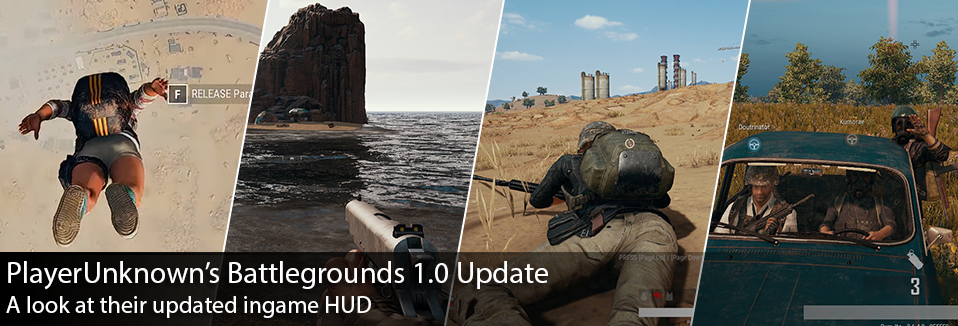
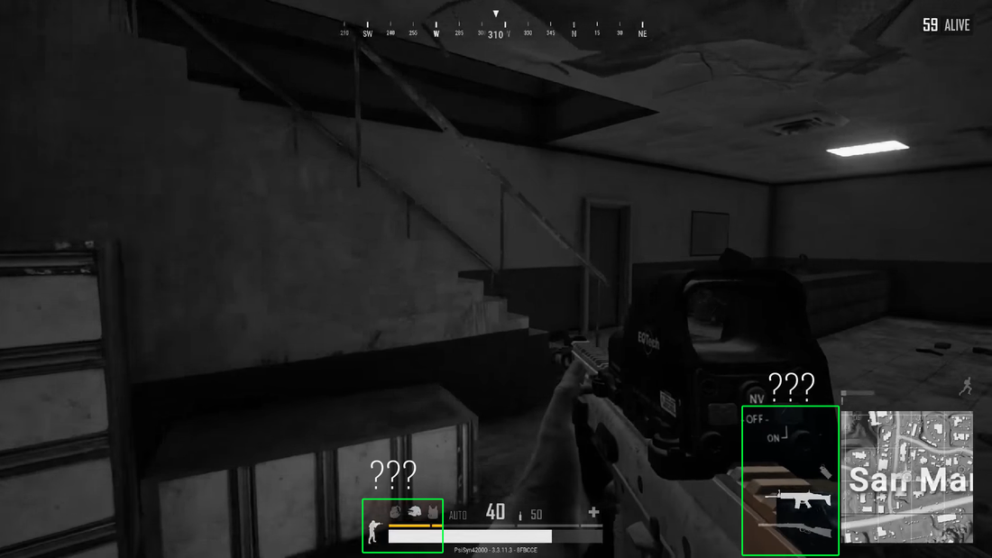
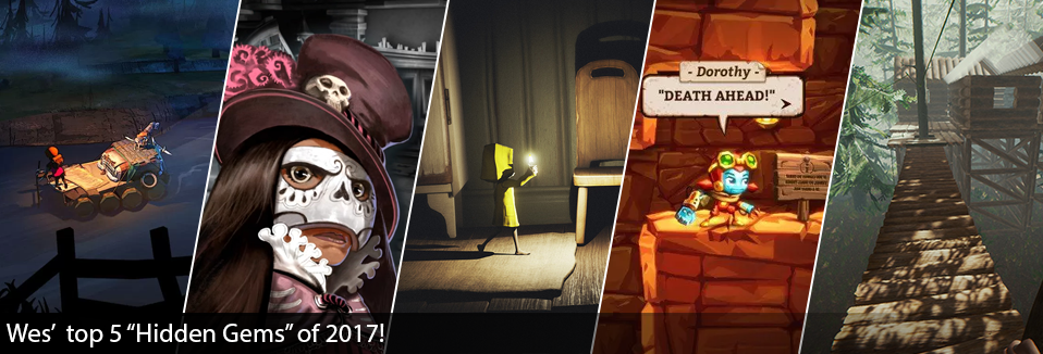
Overall these games are playing with the themes of Social Engineering in interesting ways, and some more strongly than others. The Mr. Robot app seems to probably be the strongest example of Social Engineering, but I’d love to see games go a bit further and incorporate different mechanics. For example it would be great if we were able to do more of our own research on a “fake internet” and social media profiles (Orwell), before going into a dialogue minigame either via text (Mr. Robot) or phone (The Red Strings Club), depending on the scenario. It’s interesting to play with these kind of Social Engineering dynamics, yet it’s also hard to not think of real world implications as well… Is this encouraging others to use Social Engineering to their own gain or is it harmless fun? Perhaps we should be keeping it one step removed from how it works in the real world, and a bit more fantastical. In any case I find it all pretty interesting, using similar ways of how we engage with technology in our day to day and gamifying it a bit… Ironically enough as I finish this post there's news about an Orwell's sequel, it'll be interesting to see how it might change up the formula. Until then I'll be keeping an eye out for other games that may be using Social Engineering! Last December I did a post analyzing HUD design from different shooters, one of those being PlayerUnknown’s Battlegrounds. Since then PUBG released a massive update in their 1.0 patch, that changed many aspects of the game… one of those being the HUD. I thought it would be interesting to spend some time to look at how the interface has changed, and discuss possible reasons why. Today we’ll be looking at the differences that I noticed in the HUD before and after the 1.0 patch. I’ll also being using similar terminology that I defined in my previous post, but just as a refresher this is how I previously broke down the areas of the screen : Let’s recap what we saw previously on PUBG before the patch. Mainly we found the team information located in the Primary Focus area, I previously hypothesized that this may be because it’s paramount to know how well your team is doing throughout the match. Having only one life per match, in PUBG it’s values are placed heavily on survival and keeping you and your team alive. Previously it was also noted that the match “kills” stream was located on the lower left “Secondary” area, while still prominent it’s given less visual priority compared to the Compass or the Weapon/Health area given located in the Primary Central location on the screen. Speaking again to the urgency of survival within this game. I had found it interesting that the objective was given the lowest level of visual priority at the top right hand corner of the screen and finally we see the mini-map area in the other secondary position at the bottom right. With survival being your main “goal” it makes sense to have something like your objective in such a low visual priority as it’s merely passive, compared to other game modes like capture the flag. After the 1.0 patch we see a lot of changes within the game, a few big ones and many smaller ones. Within the patch we saw updates to the main menu, a new desert map introduced, and performance improvements that have really smoothed out the play experience. Yet today we’re focusing in on the in-game HUD, and we have quite a few things to talk about. Noticeably the biggest change would be the team info, in both style and position. It’s moved away from the “Primary Focus area” and into the secondary position at the bottom left. Not only that, but there’s some pretty massive style changes with the introduction of player colors. Honestly I love this, it really helps identify who is who and their positioning on the map in a much easier way. My only complaint might be is that I constantly lose yellow and orange while in the desert map… the dot just blends into everything… Also by moving the team information downward it’s displayed the match “kills” stream, and it’s been repositioned with the objective in the area of least visual priority. Previously the kills stream was probably given too much visual priority, personally I feel like moving it with the objectives area makes it more passive information, as it should be. Also by moving the Team information down, vehicle information has also been displaced slightly to the right… which seems to work well enough. By moving more of the important information downward, and creating this sort of bottom informational bar area, it really reminds of the the same strategy of Star Wars Battlefront 2. In many ways it’s a similar strategy in having all pertinent player info at the bottom bar, and allocating top central space for more match goals and situational awareness information. In doing so it also frees up more screen real-estate for the player to be looking around in search of enemies, cluttering the bottom area is a safe bet… as your eyes are not typically searching for enemies at the very bottom of your screen. It could be argued that by moving the team info to the bottom, it effectively lowered it’s priority… which I think could only be argued if it had been replaced by something in that top left position. Since North Americans read from left to right, with the absence of any info at the top left, I would still argue that the team info is still placed in a very prominent position. That’s not to say your eyes won’t land more on the Health/Weapon area, being in the Primary Central location still, but that would make sense in level of priority. The player’s primary focus should be keeping themselves alive, and then keeping their team alive. There was also a lot of little design elements that changed within this version that I noticed while playing. For example they changed the treatment slightly on the objectives area, previously they utilized a dark box with the number of players alive alongside a white box with black text that said “ALIVE.” It’s usually pretty weak to have opposing contrasts right next to each other, i.e. white text on black and then black text on white. It doesn’t make for a very quick read at a glance. By changing it to the same white text on dark strategy, it helps with overall legibility. Not to mention the value contrast is higher in the new iteration. There are some pretty obvious changes to the team info area, in both color but also layout. By making the text white and providing it with a blurry dark background, it increases the overall legibility of the player names at a glance and is easier on the eyes. Not to mention we’re starting to repeat strategies in UI elements, white text on black. We also see this strategy being used on the “downed teammate” icon, these images may be hard to see but instead of the “aqua” player name, they have changed to a white text and dark offset shadow for legibility. I know it’s hard to see here, but the icon for the downed player actually becomes more opaque the further you are away, or when it’s on the other side of a wall. Something else I noticed was that they actually reduced the saturation levels of the mini-map, I wonder if this was to have the mini-map not compete with the new player colors introduced. For whatever reason I also noticed that they removed the ending “white box” at the end of the blue circle meter… Unsure of why they would remove it but it certainly increases the tension not exactly knowing the end of the meter. There were also some layout changes made to the Player Health and Weapon area, one of the most noticeable improvements have been with the diagonally lined area that helps player understand how much they can heal. From what I understand that diagonal bar adjusts based off of how many healing items you have, and how much you could heal yourself up to. Here again we see the same blurry box and white text treatment we see in the team health area. There was also just one last UI change that really had me confused for a while… In certain screens I could see an updated equipment and weapon UI introduced, and I couldn’t figure out why they weren’t appearing in my own personal screenshots. Until a friend of mine shared that these were actually optional UI elements that had to be turned on via the options menu. That being said, another very welcome addition to the overall PUBG UI. Overall we see general UI strategy improvements, synchronization of visual strategy, and adaptation to on screen visual priority. I’ll be curious to see how this may continue to evolve moving forward, with PUBG looking to a console release at some point… I wonder how this may impact either versions of the game. Until then I’ll be eagerly fighting and dying as much as possible in this horribly addicting game! Until next time, thanks for reading! This is it! We finally made it to the end of 2017, and… boy it’s been a dramatic year. Yet it’s been a pretty significant year in gaming! We’ve had a lot of really big games come out this year, and so I thought I might take a different approach for my "Year End" posting… Instead today I’m going to talk about some of my favorite smaller games of the year. In today’s post we’ll be exploring the “Hidden Gems” of 2017!
game is a survival game with pretty typical crafting and health mechanics. What I find particularly intriguing is the randomness of supplies and opportunities lost as you float down river. In most survival games you can sort of setup “camp” in one location, whereas The Flame in the Flood forces the player to keep moving. The visuals alone are stunning but the sound track really tops of the experience overall. The Sexy Brutale is an adventure puzzle game, which utilizes a “Groundhog day” time loop mechanic, and takes place during a masquerade ball. You’re tasked with exploring the mansion and it becomes evident pretty quick that guests are being murdered. Through each time loop you learn more and can help try to save each of the guests from being murdered. Once you save a guest, you earn their mask which grants the player with unique abilities. Overall it’s a really cute game with a grim twist. If you’re into a good mystery, I’d check it out. Little Nightmares was probably the best platformer experience I’ve had since games like Limbo or Inside. It feels like natural evolution of the “Limbo-like” genre. Little Nightmares is a platform horror adventure game, where you play as a hungry child named Six. You’re trapped inside the “Maw,” a mysterious vessel carrying grotesque and large humanoid creatures. Little Nightmares is equally creepy and intriguing at the same time… I found myself constantly curious to learn what might be around the next corner. Little Nightmares features stunning visuals, crazy character designs, amazing levels, and pretty horrific story line… If you’ve played Limbo or Inside and enjoyed it, I’d be sure to check this out. Steamworld Dig 2 is a recent find of mine, but I’m really enjoying it. If you’ve ever enjoyed just digging and exploring in other games like Minecraft or Terraria, this game will definitely scratch that itch for you. Steamworld Dig 2 is a platform-puzzle adventure game, where you’re playing as a small Robot named Dorothy. Mainly in this game you’re digging through the earth looking for minerals, avoiding enemies, and finding secret locations. Meanwhile you have your lantern that’s slowly diminishing and restricts how long you can stay down in the tunnels mining. As you find more minerals and sell them in town, you can use the currency to upgrade your equipment and buy supplies. Overall it’s really a delightful game, pretty relaxing and it’s just fun to explore. Okay so I know my last pick is probably controversial, since The Forest has been in early access since 2014… yet I played The Forest Version 0.58 that was launched in April of this year. While it could be argued that The Forest isn’t a fully released game yet… I feel like that line is blurring considerably on many titles on Steam. In any case I cannot forget my experiences with The Forest this year. This was truly a game where I did not understand it’s depth until I was plunged into it. The Forest is a first-person, open world, survival game where you’re the survivor of a plane crash. If you’re paying attention there is a story arch in this game where you’re searching for your missing son. The Forest is fantastic on many levels, between it’s building mechanics, moments of horror, enemy AI, and the level design of the island itself… it’s hard to believe this game isn’t considered final. I genuinely love chopping down trees and building in this game… it’s incredibly satisfying. Also the uniqueness of the AI constantly surprises me with unique encounters with the “locals.” This game continues to wow me, even after completing the main story arch. I highly recommend playing this, if you ever get the opportunity.
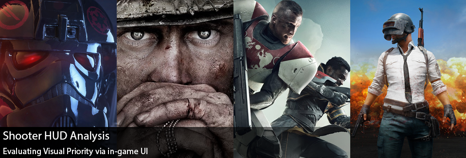
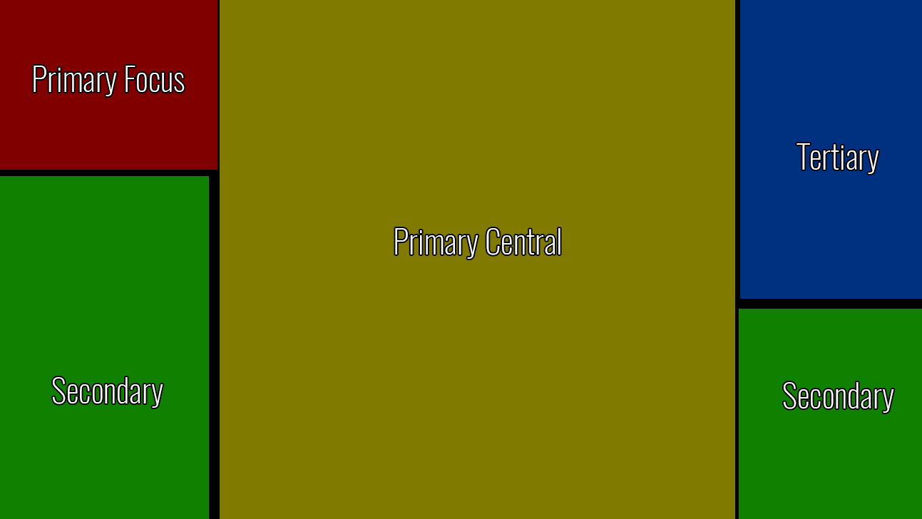
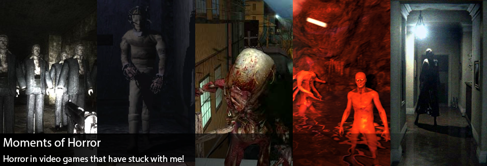
That completes my list if “2017’s Hidden Gems!” I really wanted to include PlayerUnknown’s Battlegrounds in the list, but I feel as though it has such a big following now… it’s not really all that hidden. Thanks again for reading and following along with me this year! This now marks my second full year of blogging! Feels like a big milestone for me, and hopefully you’ve enjoyed this as much as I have. See you all in 2018! Lately I’ve been playing a lot of shooters… It feels as though our fall into winter season has been full of bullets and stress. I had started working on an analysis between Call of Duty: WW2 and Star Wars Battlefront 2, and then later realized it may be interesting to add some more shooters from this year into the mix. Today we’ll be looking at in-game UI and visual objectives in Call of Duty: WW2, Star Wars Battlefront 2, Destiny 2 Crucible, and PlayerUnknown’s Battlegrounds. When working on this analysis piece I’m mainly looking at screen real estate, what information is displayed and where it’s displayed in comparison to other games of similar arch types. In doing so we can infer different design objectives used for each of the different games. With a general rule of thumb being high priority items are typically located at the top and left hand corners of the screen. As North Americans we read from the top left corner and proceed to the right, so typically elements that we deem important/what we want the player to look at first, are located in the top left and top parts of the screen. Obviously there are deviations to this rule, but it helps us formalize a starting point. For the case of this exercise I’m defining these areas as Primary Focus, Primary Central, Secondary, and Tertiary. Primary Focus acts as mission critical assets, and an area of the screen our eyes are naturally drawn to. Primary Central acts as our may field of view, and dictates where are eyes are 90% of the time. The Secondary areas balance each other out on the left and right hand corners, I allocate more vertical space on the left for the secondary since our eyes do move left to right and we put more inherit value in the left side of the screen. The Tertiary areas on the right and top of the screen seem relegated to the information that may be the lowest priority. Starting with Star Wars Battlefront 2, the immediate emphasis is more on the mission objective, mini-map, “Battle Points,” and weapon/ability information. Battlefront seems to lean heavily on utilizing the bottom portions of the screen, leaving most of the central and top areas free of any HUD distractions. I think it’s curious how it uses much more of the right side of the screen, in comparison to other games. By placing Player Kills on the right hand side, almost away from all other relevant information, it feels as though the running tally of Player Kills is given much less emphasis… Other than the mission objectives, the “Battle Points” is probably the other primary piece of information used on the players, which can feel a bit awkward in my opinion. While I do like the Battle Point system, it’s a bit awkward as if you’re doing really well in the game and have accumulated a lot of points for a new character… It almost encourages you to go die in order to swap your character out, rather than continue your streak. So while the Battle Points are an encouragement in how well you’re doing, it can almost feel like a distraction. While there is central space allocated for information on player kills, it definitely feels as though it has less emphasis compared to many other games. Call of Duty : WW2 on the other hand places emphasis on player kills first and foremost within the UI. There are large/central areas of the screen that are specifically for rewarding the player for killing an opponent. It’s interesting to note that the same “Primary Central” areas used in Star Wars for both the mission objective and the battle points, are instead replaced with player badges (for pulling off a multi-kill or specific move) and the killed opponent’s banner. By having these areas clear of information and only appear after you’ve made a kill, creates a rewarding moment for the player. It should also be noted that the Primary Focus area has the large mini-map/radar on the screen, meant to give immediate situational awareness to players. While the objective is important, it also is given significantly less visual priority on screen. The use of the HUD and streak bonuses are meant to keep the player engaged, and into your current progression...more so than the battle point system. Destiny 2 Crucible’s HUD brings a lot of familiar elements, but brings it’s own story to the table. In some ways it mimics Call of Duty’s HUD system with the mini-map/radar in the Primary Focus position, but changes itself pretty drastically by moving the Weapon/Ability info to the bottom left hand area of the screen. Changing up the formula from both Call of Duty and Star Wars, and to be fair I don’t think there’s an inherent “correct” placement for this information… I just find it interesting that they are different. Visually speaking it’s still in a secondary priority area and perhaps even giving more value considering it’s on the left. For me the main story I gather from Destiny’s HUD is the massive amount of screen allocation towards the objective and coupled team information at the top central part of the screen. Comparatively speaking it puts much more emphasis on being aware of the status of your team, who has their super ready, and the objective. Granted the team sizes are much smaller in Destiny, it still seems to emphasize the cooperation/teamwork aspects more so than perhaps other games. Now I thought it would be really fun to add PlayerUnknown’s Battlegrounds into the mix, granted this game is pretty different in comparison… at it’s foundation it’s still a shooter. Right away the first thing that stuck out to me was how little of the screen was filled with HUD. In a tense game such as this, where your death is permanent for the round, it seems paramount to allow the player as much visibility as possible. While Destiny emphasizes it’s team in a large central way, PUBG uses the Primary Focus area for your team’s health and in doing so tells us that perhaps the most important information on your screen is how well your small squad is doing. In the “Primary Central” locations we have our compass, which helps teams navigate and call out potential target positions, and our weapon/health area. Life or death in PUBG often hinges on your own status, your weapon, and how much ammo you have making it necessary to have it in a central location. Of all the games, it’s interesting that the “objective” info seems to be put in the lowest priority position here. For PUBG it works, knowing that the objective is essentially to stay alive so it’s much more passive than getting X number of kills or capturing the flag. With each of these games, mixing up the HUD strategies allows them to tell their own stories to the player. I did find it interesting some of the similarities I saw between these games… things like a small number indicating how much damage you dealing appears in Star Wars, Call of Duty, and Destiny 2. These kinds of arcade like elements work for those fast paced games were numbers are more relevant and you can spend time picking the right gun for you, versus PUBG where so much is left to chance. In any case, I hope these were some interesting insights to some potential design pillars for these different games. While they may be similar in genre, they each have their own player priorities. Well it’s late October and it seems to be that time of year to be thinking of all things spooky and more specifically to be playing some scary video games! I thought it might be fun to do a quick post about some of my scariest gaming experiences… that have unfortunately left me feeling forever unnerved! There may be some game narrative spoilers in the post, as well as youtube videos with questionable language… you’ve been warned! Condemned 2 : BloodshotThere’s a specific moment from playing this game that has always stuck with me! This game is pretty horror filled in general, but for me it was the unexpected that proved to be the most unnerving. There’s a level where as you’re exploring you see a lone “Mannequin” standing in a room… and for whatever reason I decided to punch it… nothing happened, or so I had thought. Yet when I turned around the game had spawned a group of Mannequins right behind me, just staring lifelessly at me. I half expected them to attack, but it was almost worse that they didn’t… For whatever reason, this has always stuck with me! Check the video below : Thief : Deadly ShadowsThief wasn’t intended to be a horror game… or so I had thought on going into it. I had expected a suspenseful, stealthy, romp through a fantasy medieval setting… but the game had more in store for me. There’s a mission called “Robbing the Cradle” where you go to a location called Shalebridge Cradle. Now the history of the “Cradle” is that it was once an insane asylum, and before that it was an orphanage… and even for a short amount of time housed both orphans and asylum inmates… One night an inexplicable fire broke out, and since then the “Cradle” has been abandoned. On entering the mission, it becomes obvious fairly quickly that it’s haunted. As you dive deeper into the asylum/orphanage, it’s revealed that the Cradle has the ability to “remember” people and trap them inside… So the player is then forced to traverse backwards through time and fake their own suicide so that the Cradle will forget them and let them go… All the while avoiding asylum inmates and burned orphans… it was seriously messed up. So messed up that PCGamer released an entire 10 page review just on the Cradle itself in March 2005. Calling it “One of the scariest missions in video game history.” Half Life 2I think many gamers have fond memories of Half Life 2, but for me… in 2004… it scared the crap out of me. More specifically the mission that brought us to Ravenholm, an old mining town turned deserted and infested with Zombies and Headcrabs. Overall I always found the zombies in Half Life 2 to be so upsetting… their twitching movements, and horrific noises was truly upsetting to young Wes. I’ve just always remembered this one moment where I was so scared trying to make my way through Ravenholm, and I had just successfully set a “fire trap” for a group of Zombies. As the fire went off, I felt a moment of relief as I watched them burn… only to have that interrupted by a headcrab flying through the flames towards my face! I quickly paused the game, only to have the pause screen just be the flaming headcrab filling the screen. I had to walk away from the computer for a while in order to build up the courage to go back… The ForestMore recently The Forest has made a pretty considerable impact on me. I think this is a game that really flies under the radar of most gamers, yet it’s extremely well done. Not only from a survival game standpoint, but also a very considerable plot line buried within the game… Intentional or not, The Forest is a wonderful slow burn that at times lulls the player into a false sense of security… only to have that come crushing down. In the first moments of the game you may encounter these cannibalistic tribal people, that inhabit the island you’ve crashed on. Alone they are pretty scary, they can silent creep up on the player while they are gathering supplies and trying to stay alive. They have high pitched screams that can truly rattle you, and are highly unpredictable. Then there’s the mutants on the island… amorphous abominations of human body parts, hobbling their way towards you… it’s pretty bad. Yet the real horror gem in all of this, are the caves. I’ve been in dark scary places in video games before, but these caves felt different. There’s always a clear uneasiness about the caves, lack of light, and the very real possibility of getting lost. It felt like “The Descent” the video game… couple that with discovering rooms filled with blood and body parts. It’s tense as hell, and the ending of the game left me considerably shaken. If you haven’t yet, go play The Forest… It’s on sale right now ;) P.T.Any list about horror video games would be remiss if they didn’t include an nod to P.T. Released in 2014 as a random download on PSN, P.T. or “Playable Teaser” was a hidden and secret teaser for an upcoming Silent Hill game. It quickly became an internet sensation as people discovered hidden layers and secret messages within this small game. The game is so extremely well done, but also so incredibly unnerving. There’s a specific breathing noise that the “ghost” gives off, that to this day still gives me chills. Couple that with the fact that every playthrough is seemingly different and random… adds to the allure and fear of this game. There’s so many things that this small teaser does perfectly, but for me the best moment is at a certain point the game seems to start to glitch. It starts with a small visual glitch on the screen… the screen looks like the “camera” has been damaged. It slowly starts to get worse as a demonic voice begins repeating the same sequence of numbers over and over again, until finally the game makes it look like your PS4 has frozen and there’s an error code on screen… and reboots. After the “reboot” the game pretends to start over again, but if you have a keen eye you’ll notice subtle differences in the new intro and know that the game hasn’t started over… it’s merely continuing. If you have the time, look up a playthrough or perhaps read this article they go into considerably more depth than I could. I think my one last nod might actually be to Red Dead Redemption, Kotaku did a really great write up of some of the game’s weird and creepy moments… In any case I hope you enjoyed reading! Hope you’re all enjoying this Halloween Holiday with a spooky movie, or horror game… preferably with friends… :)
|
AuthorI make games, I play games... and sometimes I have some thoughts about that. Archives
March 2024
|
Proudly powered by Weebly













 RSS Feed