|
|
Personal Projects
|
|
|
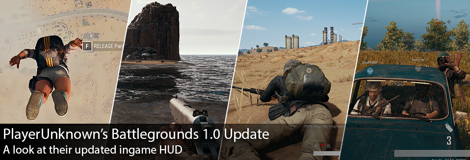
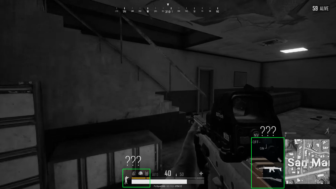
Last December I did a post analyzing HUD design from different shooters, one of those being PlayerUnknown’s Battlegrounds. Since then PUBG released a massive update in their 1.0 patch, that changed many aspects of the game… one of those being the HUD. I thought it would be interesting to spend some time to look at how the interface has changed, and discuss possible reasons why. Today we’ll be looking at the differences that I noticed in the HUD before and after the 1.0 patch. I’ll also being using similar terminology that I defined in my previous post, but just as a refresher this is how I previously broke down the areas of the screen : Let’s recap what we saw previously on PUBG before the patch. Mainly we found the team information located in the Primary Focus area, I previously hypothesized that this may be because it’s paramount to know how well your team is doing throughout the match. Having only one life per match, in PUBG it’s values are placed heavily on survival and keeping you and your team alive. Previously it was also noted that the match “kills” stream was located on the lower left “Secondary” area, while still prominent it’s given less visual priority compared to the Compass or the Weapon/Health area given located in the Primary Central location on the screen. Speaking again to the urgency of survival within this game. I had found it interesting that the objective was given the lowest level of visual priority at the top right hand corner of the screen and finally we see the mini-map area in the other secondary position at the bottom right. With survival being your main “goal” it makes sense to have something like your objective in such a low visual priority as it’s merely passive, compared to other game modes like capture the flag. After the 1.0 patch we see a lot of changes within the game, a few big ones and many smaller ones. Within the patch we saw updates to the main menu, a new desert map introduced, and performance improvements that have really smoothed out the play experience. Yet today we’re focusing in on the in-game HUD, and we have quite a few things to talk about. Noticeably the biggest change would be the team info, in both style and position. It’s moved away from the “Primary Focus area” and into the secondary position at the bottom left. Not only that, but there’s some pretty massive style changes with the introduction of player colors. Honestly I love this, it really helps identify who is who and their positioning on the map in a much easier way. My only complaint might be is that I constantly lose yellow and orange while in the desert map… the dot just blends into everything… Also by moving the team information downward it’s displayed the match “kills” stream, and it’s been repositioned with the objective in the area of least visual priority. Previously the kills stream was probably given too much visual priority, personally I feel like moving it with the objectives area makes it more passive information, as it should be. Also by moving the Team information down, vehicle information has also been displaced slightly to the right… which seems to work well enough. By moving more of the important information downward, and creating this sort of bottom informational bar area, it really reminds of the the same strategy of Star Wars Battlefront 2. In many ways it’s a similar strategy in having all pertinent player info at the bottom bar, and allocating top central space for more match goals and situational awareness information. In doing so it also frees up more screen real-estate for the player to be looking around in search of enemies, cluttering the bottom area is a safe bet… as your eyes are not typically searching for enemies at the very bottom of your screen. It could be argued that by moving the team info to the bottom, it effectively lowered it’s priority… which I think could only be argued if it had been replaced by something in that top left position. Since North Americans read from left to right, with the absence of any info at the top left, I would still argue that the team info is still placed in a very prominent position. That’s not to say your eyes won’t land more on the Health/Weapon area, being in the Primary Central location still, but that would make sense in level of priority. The player’s primary focus should be keeping themselves alive, and then keeping their team alive. There was also a lot of little design elements that changed within this version that I noticed while playing. For example they changed the treatment slightly on the objectives area, previously they utilized a dark box with the number of players alive alongside a white box with black text that said “ALIVE.” It’s usually pretty weak to have opposing contrasts right next to each other, i.e. white text on black and then black text on white. It doesn’t make for a very quick read at a glance. By changing it to the same white text on dark strategy, it helps with overall legibility. Not to mention the value contrast is higher in the new iteration. There are some pretty obvious changes to the team info area, in both color but also layout. By making the text white and providing it with a blurry dark background, it increases the overall legibility of the player names at a glance and is easier on the eyes. Not to mention we’re starting to repeat strategies in UI elements, white text on black. We also see this strategy being used on the “downed teammate” icon, these images may be hard to see but instead of the “aqua” player name, they have changed to a white text and dark offset shadow for legibility. I know it’s hard to see here, but the icon for the downed player actually becomes more opaque the further you are away, or when it’s on the other side of a wall. Something else I noticed was that they actually reduced the saturation levels of the mini-map, I wonder if this was to have the mini-map not compete with the new player colors introduced. For whatever reason I also noticed that they removed the ending “white box” at the end of the blue circle meter… Unsure of why they would remove it but it certainly increases the tension not exactly knowing the end of the meter. There were also some layout changes made to the Player Health and Weapon area, one of the most noticeable improvements have been with the diagonally lined area that helps player understand how much they can heal. From what I understand that diagonal bar adjusts based off of how many healing items you have, and how much you could heal yourself up to. Here again we see the same blurry box and white text treatment we see in the team health area. There was also just one last UI change that really had me confused for a while… In certain screens I could see an updated equipment and weapon UI introduced, and I couldn’t figure out why they weren’t appearing in my own personal screenshots. Until a friend of mine shared that these were actually optional UI elements that had to be turned on via the options menu. That being said, another very welcome addition to the overall PUBG UI. Overall we see general UI strategy improvements, synchronization of visual strategy, and adaptation to on screen visual priority. I’ll be curious to see how this may continue to evolve moving forward, with PUBG looking to a console release at some point… I wonder how this may impact either versions of the game. Until then I’ll be eagerly fighting and dying as much as possible in this horribly addicting game! Until next time, thanks for reading!
0 Comments
Leave a Reply. |
AuthorI make games, I play games... and sometimes I have some thoughts about that. Archives
March 2024
|
Proudly powered by Weebly







 RSS Feed