|
|
Personal Projects
|
|
|
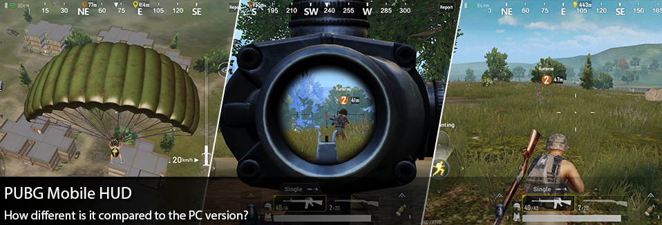
Okay so… I know I’ve been talking a lot about Playerunknown’s Battlegrounds, and if this is any indication I’ll likely continue this trend as long as this game evolves, releases new modes to play with, changes their UI, and drops alternative versions of itself… Specifically today we’ll be talking about the new Mobile PUBG that was released just this last month world wide! Honestly I typically have pretty low opinions of shooters on phones, so I was pretty hesitant to pick this up. Yet I have to say my first experiences into the game were pretty wonderful, and as ever I noticed a lot of changes to the HUD from the PC version. Today we’ll specifically be looking at and comparing the UI changes between the Mobile and PC version, and discussing why they might have made these kinds of changes. To start if you’re unfamiliar with my previous breakdown of PUBG’s UI changes, I’d encourage you to check out my previous post on the 1.0 update. Upon first glance of the Mobile HUD, it feels a bit odd to compare the two. There’s a ton of screen real estate that needs to be allocated for user controls and interactions on either side of the screen. Although we can start to pick up their strategy fairly quickly, in the past I’ve identified the Mini-Map and the “Team Info” as primary focus information needed for the player. While these elements have been moved down and to the sides on the PC version, in a sort of “bottom bar” area for all player important info, these same elements have actually been moved to the upper corners of the screen in the Mobile version. Doing so, frees up this info from being too covered up by the user’s hands as they try to utilize the thumb controls. Keeping the primary weapon/ability info at the bottom center still feels pretty right in this version, there's something about UI at the bottom that implies ownership to the player… like this is “my info.” Also the Objective Info and Player kills swapped sides of the screen to free up real estate for the mini-map placement, which seems to balance out the screen nicely. While on first glance I found the screen to be pretty cluttered on the mobile version, it’s really not too bad once you get into the game. Beyond different placement of UI elements into the game, what’s more revealing are the changes done to the individual elements. Since my last review of the PUBG hud, I’ve often complained about the extremely minor changes to the equipment icons when you pick up new items such as a helmet or a backpack. In the PC version there’s only a slight icon change, which makes it very hard to read if you’re using a level 1 or level 2 item… YET this is fixed on the Mobile version, by adding some simple iconography that indicates item levels. Also there’s a small gauge added to around the backpack icon that helps show the player how full their inventory is. Something else I noticed while reviewing these elements were that the Mobile version seemed to be much more interested in illustrating distances to the player. I noticed that in the teammate’s marker, the mini-map, and the compass now all show meter distances to objectives; something that isn’t done on the PC version. I find this sort of interesting, and a bit confusing… For me seeing how far I am away from the edge of the white circle might help, but teammate and objective distances feels like less of a concern for me. Yet it could be since I’m used to the PC version which doesn’t have this feature, and I’m used to just referencing the map or mini-map to get that info quickly. I also noticed on the compass that as you turn in the Mobile version, it doesn’t show you your direct heading like it does in the PC. Instead it prioritizes the latest marker placed on the map. This sort of impedes some of the basic communication elements you have while playing PUBG, you’re often telling your teammates where shots are being fired from, yet in the Mobile version at best you can say general heading… which may imply that accuracy is less important on the Mobile version where everything feels slightly condensed compared to the PC. After becoming so intimately familiar with the PUBG map on the PC version, it was very cool to see how well these environments were translated onto the Mobile game. Our favorite areas of the game, namely the “dorms” near the school, feel just as familiar and right as they do in the PC version. Yet there’s something “smaller” about the mobile version that I really couldn’t put my finger on. I do genuinely wonder if the world is ever so slightly smaller, perhaps we move just a little bit faster as well, all in an effort to encourage slightly smaller game times on the mobile version. Looking through youtube and reddit boards it’s very easy to find data on the PC version of the game, and more specifically how long it takes someone to run across the map. Yet there isn’t any real “data” out there yet on the Mobile version. The best way I had to compare was to start reviewing different “let’s play” videos of finished games, and compare average game lengths between the PC and the Mobile version. What I found is that the PC version is typically 30-35 minutes to a completed “win” game scenario, whereas the mobile version tends to run more like 20-25 minutes. Honestly I was expecting it to be more drastic than that, while playing on the mobile game everything felt much faster… yet this could just be a result of my familiarity to the PC version that made it feel THAT much faster. I’d be really curious to dig more into what strategies they used to accomplish this, is the island actually smaller? Is the circle a bit faster? Do we move at different speeds compared to the PC version? It’s likely a combination of strategies, and also a feeling emphasized by playing on a smaller handheld device. Whoever designed the controls and minor tweaks to the game’s interactions, did an excellent job. Not being a huge mobile shooter fan, I was at first confused with the duplicated shoot buttons on both the left and the right hand side of the screen. Until I wanted to either shoot and strafe or shoot and aim, using different thumbs to do so. These controls become extremely intuitive as you found yourself in a firefight. Unsure of how to change the fire mode? Maybe just tap the “single fire” button above your weapon. While I appreciate how easy it is to understand the different movement types (crouch, prone, stand, and jump), I couldn’t really see myself doing the same sort of vaulting maneuvers that I’ve become accustomed to in the PC version. For me it feels a bit hard to navigate with my thumbs, and instead of jumping over objects I found myself much more paranoid about just crouching or going prone. Which isn’t necessarily a bad thing, just an observation. The auto-sprint functionality works extremely well, noticing that as your drag your thumb forward there’s an indication to “lock” your sprint… once I discovered this, it made movement a lot easier. Finally the auto loot system really takes the stress out of the looting aspects of the game. I think in many ways it also helps speed up the gameplay, so much of my time on the PC version is spent looking at the ground and deciding what I want to pick up. Yet within the Mobile version it’s pretty quick and easy, at times I was slightly annoyed with an inventory window that wouldn't go away… but overall it feels really elegant and built towards player ease of use on a mobile platform.
Overall I was very pleasantly surprised with the Mobile version of PUBG, granted my expectations were pretty low but I felt the same kinds of excitement that I feel while playing the PC version. I know there’s some speculation right now that much of the game might be filled with bots, which could account for my very first match resulting in a chicken dinner… yet for me this really didn’t lessen my enjoyment of it. I’m not sure how much time I’ll devote to the mobile version, just because I don’t play too much on my phone… Yet it’s sort of fun knowing that I can. They’ve done quite a few typical mobile gaming tricks to bring people back, i.e. daily rewards… etc that if they added to the PC version, you’d likely see me being more vigilant about logging in. There’s also a “Missions” and “Events” system introduced here, that I think are also interesting rewarding mechanics that should probably be introduced into the PC version as well. These sorts of “carrots” are typically associated with just mobile games, yet could bring a lot of life back into the PC version. As much fun as a random crate is every once in a while… the PC version could use more rewards to keep players engaged, even if they aren’t having good matches. In any case I imagine we could start seeing this sort of cross pollination between different versions of the game, as it’s obvious to see different teams working with the franchise, and they can easily see what works and what doesn’t cross platform.
0 Comments
Leave a Reply. |
AuthorI make games, I play games... and sometimes I have some thoughts about that. Archives
March 2024
|
Proudly powered by Weebly






 RSS Feed