|
|
Personal Projects
|
|
|
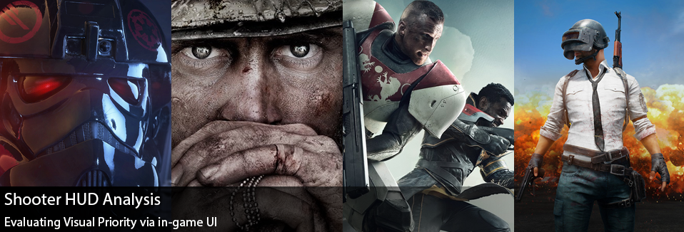
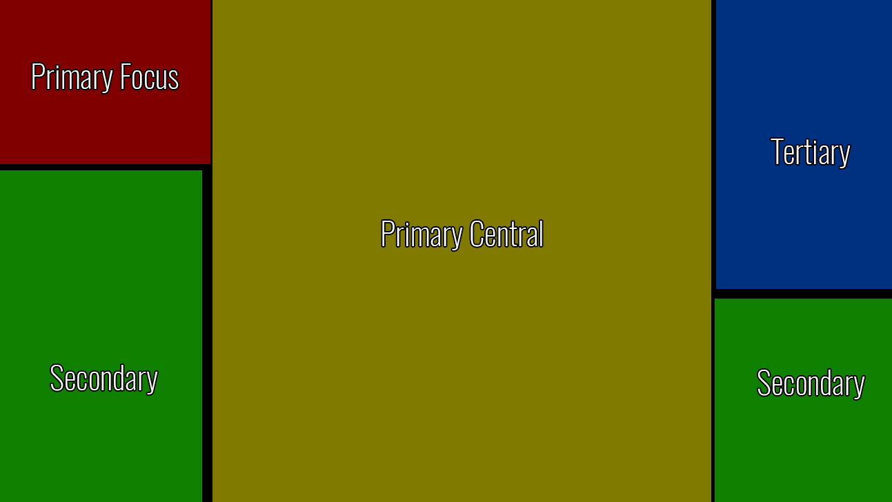
Lately I’ve been playing a lot of shooters… It feels as though our fall into winter season has been full of bullets and stress. I had started working on an analysis between Call of Duty: WW2 and Star Wars Battlefront 2, and then later realized it may be interesting to add some more shooters from this year into the mix. Today we’ll be looking at in-game UI and visual objectives in Call of Duty: WW2, Star Wars Battlefront 2, Destiny 2 Crucible, and PlayerUnknown’s Battlegrounds. When working on this analysis piece I’m mainly looking at screen real estate, what information is displayed and where it’s displayed in comparison to other games of similar arch types. In doing so we can infer different design objectives used for each of the different games. With a general rule of thumb being high priority items are typically located at the top and left hand corners of the screen. As North Americans we read from the top left corner and proceed to the right, so typically elements that we deem important/what we want the player to look at first, are located in the top left and top parts of the screen. Obviously there are deviations to this rule, but it helps us formalize a starting point. For the case of this exercise I’m defining these areas as Primary Focus, Primary Central, Secondary, and Tertiary. Primary Focus acts as mission critical assets, and an area of the screen our eyes are naturally drawn to. Primary Central acts as our may field of view, and dictates where are eyes are 90% of the time. The Secondary areas balance each other out on the left and right hand corners, I allocate more vertical space on the left for the secondary since our eyes do move left to right and we put more inherit value in the left side of the screen. The Tertiary areas on the right and top of the screen seem relegated to the information that may be the lowest priority. Starting with Star Wars Battlefront 2, the immediate emphasis is more on the mission objective, mini-map, “Battle Points,” and weapon/ability information. Battlefront seems to lean heavily on utilizing the bottom portions of the screen, leaving most of the central and top areas free of any HUD distractions. I think it’s curious how it uses much more of the right side of the screen, in comparison to other games. By placing Player Kills on the right hand side, almost away from all other relevant information, it feels as though the running tally of Player Kills is given much less emphasis… Other than the mission objectives, the “Battle Points” is probably the other primary piece of information used on the players, which can feel a bit awkward in my opinion. While I do like the Battle Point system, it’s a bit awkward as if you’re doing really well in the game and have accumulated a lot of points for a new character… It almost encourages you to go die in order to swap your character out, rather than continue your streak. So while the Battle Points are an encouragement in how well you’re doing, it can almost feel like a distraction. While there is central space allocated for information on player kills, it definitely feels as though it has less emphasis compared to many other games. Call of Duty : WW2 on the other hand places emphasis on player kills first and foremost within the UI. There are large/central areas of the screen that are specifically for rewarding the player for killing an opponent. It’s interesting to note that the same “Primary Central” areas used in Star Wars for both the mission objective and the battle points, are instead replaced with player badges (for pulling off a multi-kill or specific move) and the killed opponent’s banner. By having these areas clear of information and only appear after you’ve made a kill, creates a rewarding moment for the player. It should also be noted that the Primary Focus area has the large mini-map/radar on the screen, meant to give immediate situational awareness to players. While the objective is important, it also is given significantly less visual priority on screen. The use of the HUD and streak bonuses are meant to keep the player engaged, and into your current progression...more so than the battle point system. Destiny 2 Crucible’s HUD brings a lot of familiar elements, but brings it’s own story to the table. In some ways it mimics Call of Duty’s HUD system with the mini-map/radar in the Primary Focus position, but changes itself pretty drastically by moving the Weapon/Ability info to the bottom left hand area of the screen. Changing up the formula from both Call of Duty and Star Wars, and to be fair I don’t think there’s an inherent “correct” placement for this information… I just find it interesting that they are different. Visually speaking it’s still in a secondary priority area and perhaps even giving more value considering it’s on the left. For me the main story I gather from Destiny’s HUD is the massive amount of screen allocation towards the objective and coupled team information at the top central part of the screen. Comparatively speaking it puts much more emphasis on being aware of the status of your team, who has their super ready, and the objective. Granted the team sizes are much smaller in Destiny, it still seems to emphasize the cooperation/teamwork aspects more so than perhaps other games. Now I thought it would be really fun to add PlayerUnknown’s Battlegrounds into the mix, granted this game is pretty different in comparison… at it’s foundation it’s still a shooter. Right away the first thing that stuck out to me was how little of the screen was filled with HUD. In a tense game such as this, where your death is permanent for the round, it seems paramount to allow the player as much visibility as possible. While Destiny emphasizes it’s team in a large central way, PUBG uses the Primary Focus area for your team’s health and in doing so tells us that perhaps the most important information on your screen is how well your small squad is doing. In the “Primary Central” locations we have our compass, which helps teams navigate and call out potential target positions, and our weapon/health area. Life or death in PUBG often hinges on your own status, your weapon, and how much ammo you have making it necessary to have it in a central location. Of all the games, it’s interesting that the “objective” info seems to be put in the lowest priority position here. For PUBG it works, knowing that the objective is essentially to stay alive so it’s much more passive than getting X number of kills or capturing the flag. With each of these games, mixing up the HUD strategies allows them to tell their own stories to the player. I did find it interesting some of the similarities I saw between these games… things like a small number indicating how much damage you dealing appears in Star Wars, Call of Duty, and Destiny 2. These kinds of arcade like elements work for those fast paced games were numbers are more relevant and you can spend time picking the right gun for you, versus PUBG where so much is left to chance. In any case, I hope these were some interesting insights to some potential design pillars for these different games. While they may be similar in genre, they each have their own player priorities.
0 Comments
Leave a Reply. |
AuthorI make games, I play games... and sometimes I have some thoughts about that. Archives
March 2024
|
Proudly powered by Weebly








 RSS Feed