|
|
Personal Projects
|
|
|
Hey guys!
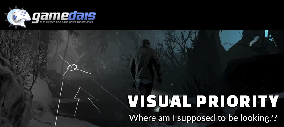
This week I've teamed up with the website GameDais to bring you an article about Visual Priority! In it I take a closer look at games like FIrewatch, Until Dawn, and Outlast! Enjoy! Wes ***update*** It looks like maybe the GameDais website went down, as the URL seems to no longer be functioning. So I wanted to share what I had written for them here, below are my notes from the article I created in conjunction with them. I know I also had images associated with this... but can no longer find them. Hopefully GameDais will return in the future. I went into this entry thinking that I’d like to spend a bit of time breaking down Visual Priority for you. Visual Priority refers to an inherent hierarchy of information on the screen, typically defined by Primary, Secondary, and Tertiary sources of information. These can established through shape/size, color, screen location, and contrast… yet at the end of the day this evaluation is all about taking a step back and trying to analyze where the developers would like us to be looking, and why. Attempting to understand what’s important? What kind of visual real-estate is reserved for this value? Where are my eyes drawn, and why? I think it could be interesting to do a bit of an analysis of strategies used to guide us in our gaming experiences. Visual priority, and how it’s treated, can change drastically between types of games and devices. Specifically strategies and what’s important to display in mobile games are extremely different than the ones used in console gaming. Interfaces (typically) are much more prevalent on a mobile game, than their console counterparts. I was thinking about this recently as I began to dig into this topic, and began to realize that many of the elements that I look for while evaluating mobile games are not prioritized in the same way as you’d see on consoles. The inference I’d make here is that when you’re interacting with a mobile game, you’re also basically looking at the controler…. so there has to be much more information available for interaction. Whereas the trend with console games are typically leaning more on leveraging the play space, and when you are interacting with something… you’re pushing a button on a controller rather than physically on the screen. In this regard, it makes a lot of sense that the strategies would be drastically different. That being said, I’d like to spend a bit of time exploring how console games are helping users understand what’s expected of them. To start with, I began to try to think of games that felt instinctual for navigation. Games that I rarely got lost in, and instinctively knew here to go. I know I’ve talked for many posts about Firewatch already but, I seriously can’t help it…. It’s excellent on many levels. The easiest way to evaluate visual priority is just to take screenshot from a game, and take a moment to evaluate what’s in front of you. Where are you eyes drawn and why? In the case of Firewatch, there’s a complete absence of UI… I mean there’s the occasional walkie-talkie, map, or interaction indication but for the most part it’s all about the world in front of you. Upon looking at imagery from Firewatch, you begin to notice that your eyes are guided. There’s always a direction, a point of interest, or natural flow. It allows the user to be guided in a direction without putting them on rails. That’s not to say that you can’t lose your way, but I would argue that through lighting, contrast, and negative space the developers have done what they could to direct the users in the most natural ways possible. (I’ve talked about this breifly in the past, in my post about Visual Affordance : http://www.wesplays.com/blog/visual-affordance) While it’s possible that colors and hue variation can be used, typically I focus more on contrasting tones to evaluate visual priority. For this, it’s always best to desaturate your examples and look at them in grayscale. Sometimes it can be quite shocking what your eyes are actually be drawn to. In these examples, I’ve tried my best to illustrate my meaning… how points of interest, lighting, and negative space can create a natural flow and understanding for the viewer. In the same vein, I also was thinking a lot about Until Dawn and how the environments often lended themselves to an innate understanding of the space. Granted Until Dawn is pretty structured in the sense that the movement possibilities are a lot less extensive than a game like Firewatch. Yet each scene is definitely crafted, intentional camera angles, lighting, and focal points created to give the player an understanding of interaction/movement possibilities. Upon further investigation into Until Dawn, I really noticed that they used perspective to their advantage in many cases; aligning elements along a vanishing point and facilitating this flow with lighting/contrast. In many cases there’s literally a source of light at the point in which we’re expected to move. A game that always resonated with me was also Outlast. While there were definitely times of confusion, there was something about the layout of this game that facilitated intentional progression. Lighting placement, points of interests, and elements that specifically catch your eye (blood spatter, creep silhouettes, etc) gave way to player progression in a way that feels more like exploration than developer handholding. I can’t help but bring up an approach that Splinter Cell : Conviction used, which was to literally project quest objectives on the walls and on the environment to guide the player. This was just such a fun and creative approach to marrying UI within the environment. Not only are you spelling it out for the player, but the placement of the message is also a subtle hint to where you’re intended to go. It goes to show that sometimes that being a little more in your face, can actually be a good thing and not pull you completely out of the game. Next time you’re playing a video game, take a moment and ask yourself “What’s the intent here?” This will help you to develop a deeper understanding of the clues you’re being presented but also a little more insight into the developers themselves. Conversely, if you’re lost and confused… it’d be interesting to take a moment to attempt to recognize where the design is failing you. This way we can start identifying both strong and weak design principles, that’ll help guide us in the future. Hey guys! I’m a new guest author on GameDais.com! If you’re interested in reading more about topics like “Visual Affordance,” “Gamifying your Play Experience,” or “Quantifying Art” feel free to visit my original blog at www.WesPlays.com Thanks for reading!
0 Comments
Leave a Reply. |
AuthorI make games, I play games... and sometimes I have some thoughts about that. Archives
March 2024
|
Proudly powered by Weebly


 RSS Feed