|
|
Personal Projects
|
|
|
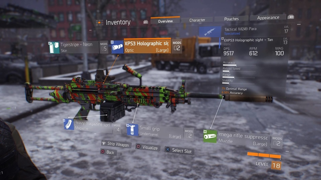
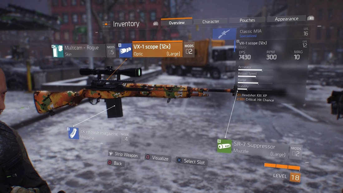
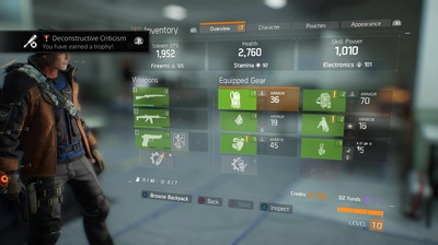
This week I started playing the Division, which is such a contrast to what I’ve been playing/writing about recently. Considering the last few games have had little to no HUD and jumping into the Division you quickly realize that this is such a UI intensive game. Much of it well thought out and even more that’s just fun tech fluff on the screen. In this post I’d like to spend some time to break down The Divisions HUD and usability. While I will be talking about elements of The Division, this post should be devoid of spoilers. Yet if you’re concerned about seeing imagery from The Division, you should stop now! To start with, there’s a sort of implied complexity when it comes to the name “Tom Clancy.” It often feels like the name has become synonymous intense and elaborate worlds, that borderlines more on simulations than games. Tom Clancy games are often known for their seriousness and that can be a barrier between itself and casual to mid-core audiences. While Tom Clancy’s : The Division, does a lot of things right… there are areas of the game that aren’t particularly user friendly. Specifically within modding your weapons/equipment, but also within leveling your character up. It’s difficult because these are areas that players do inherently look for additional depth, and yet if you’re not interested in these areas or just starting out… there’s a considerable barrier to entry.
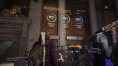
the player a sense of what play-style these elements are referring to. I really have to applaud The Division's use of color when it comes to missions, I instantly know if working towards the Medical, Tech, or Security wings. Ideally there would be a similar way for me to classify my mods, so that I could instantly recognize areas that facilitate my play style. I would also argue that an auto-assign or recommendation feature would be very ideal for more casual users.
exciting either. When I mod my weapon, it should feel impactful and like I’m progressing. Perhaps when the user starts seeing higher percentages late game, it will feel like real progress. If the strategy is to keep the values so low early game, so we feel the progression later, we’re really banking on players sticking around long enough to make it worth it. It’s risky to not have the early phases of the game not feel as rewarding as possible. Seeing my weapon stat bars barely move with a new mod, can be very detrimental to initial user experience.
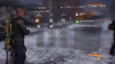
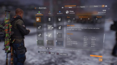
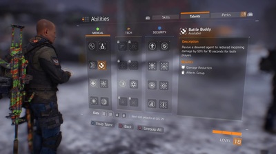
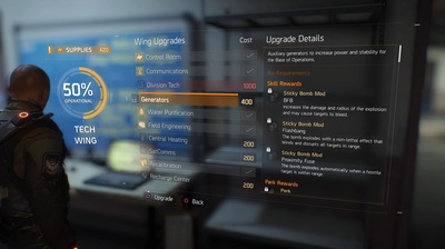
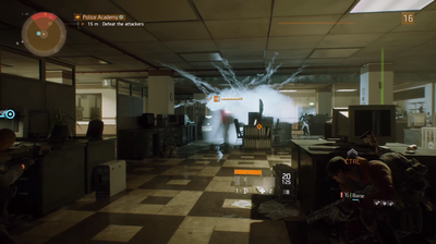
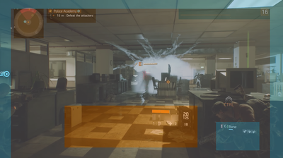
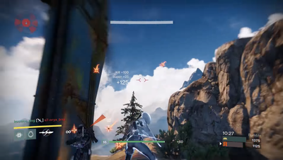
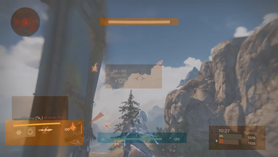
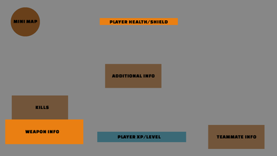
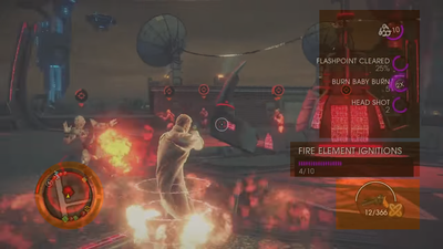
Advance – rolling from one piece of cover to another increase damage done by 2% per meter traveled for a short period of time” or “Death by Proxy – destroying another enemies deployed items (turrets) increases the power of your skill abilities.” While I can, more or less, understand what my talents do… the way these are managed make it very difficult to decide what’s best for your play style. Whereas I’m just happy to unlock a perk, because then I literally don’t think twice about it knowing that it’s just there. I will say that one of the areas that makes this very hard to understand is how you unlock areas in the different wings in your base. Whenever you unlock something in one of the three wings, you can unlock a multitude of Skills, Skill Mods, Talents, Perks (both for your character or the base itself) and it can be a bit much to understand. Instead of writing out each mod I’m unlocking for my turret, maybe just tell me that this will unlock mods for my turret… being concise doesn't mean it has to lack depth. There's also really no substitute for a good Skill Tree, it's always a clear and easy way to illustrate progression to a player. Going into The Division, I was really unsure how I felt about the floating HUD near my character. It felt weird at first and I was unsure if it would become confusing in the middle of a firefight. Yet the more I played with it, the more I really enjoyed the layout. In an effort to better understand their design choices, I decided to do a bit more research into their strategies as well as their competitors. The Division
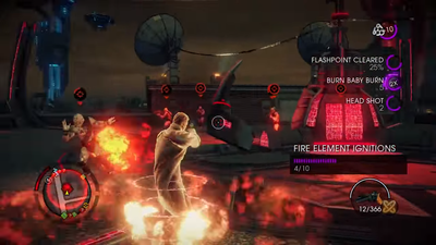
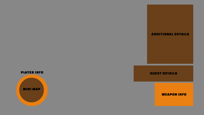
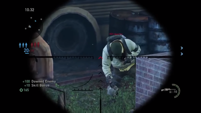
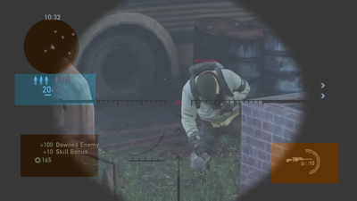
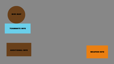
which it’s UI hidden on the protagonist’s back. There’s something to be said about doing something as bold as this, thinking about Visual Priority and screen real-estate… putting the player’s info in the center of the screen is prioritizing you and your character. This isn’t a side attribute, this is YOU and YOU should be paying attention to it. I think it creates an extremely positive dynamic and facilitates a higher connection with the player and their avatar. Of course this is just my impressions/take away from comparing The Division's HUD to it’s competitors, but it’s interesting to see how they do or do not relate to each other.
1 Comment
When I was a kid, I used to play different virtual games and I had to pay for it! Games before were very limited; the graphics are not yet very impressive but enough to make a child happy. I am happy to see that this game is wise when it comes to graphics. The field is also bigger compared to the filed we used to have before. That's why if only I have the chance to play online games once more, I will gran the opportunity while it is still there! The Division : Interface and Usability seems like a nice game that we should play!
Reply
Leave a Reply. |
AuthorI make games, I play games... and sometimes I have some thoughts about that. Archives
March 2024
|
Proudly powered by Weebly












 RSS Feed