
|
|

|
|
|
Personal Projects
|
|
|
|
|
|
|
|
Personal Projects
|
|
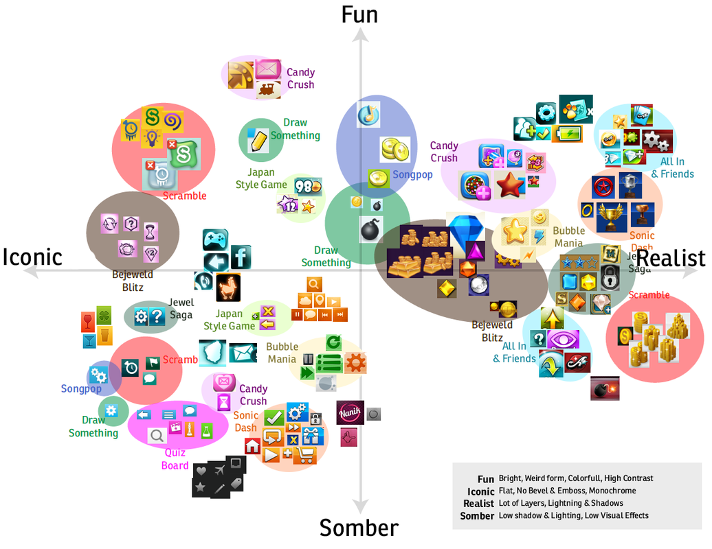
 Have you ever been asked to making something look “more fun?” What about more user friendly, interesting, or even magical? As an artist it can be very difficult to have productive conversations about art or art qualities, qualities like “fun” or “magical” can have drastically different meanings based off of the individual or project context. Not to mention if you’re working with individuals where English may not be their primary language, it can be very difficult to come to an understanding about artistic intent. In this post I’d like to explore this a little bit, and share some of my experience as a Lead Artist working on mobile games. Quantifying Art really comes into play heavily during pre-production, where you're lacking visuals and trying to establish the artistic direction. So often it feels easy to fall back on broad terms and simplified descriptions, but these can really cause a lot of problems. Not only can it become vague and hard to follow for your clients, but it's also really unfair to the artists that you're working with. People are quick to infer their own meanings and it leads to a lot of misinterpretation. So what can be done? I'm sure there are a lot of different strategies out there, but I'm only really going to be talking about how I approach it. This really isn't mean to be the definitive "how to" but hopefully it should give a little more insight into some new ways of thinking...
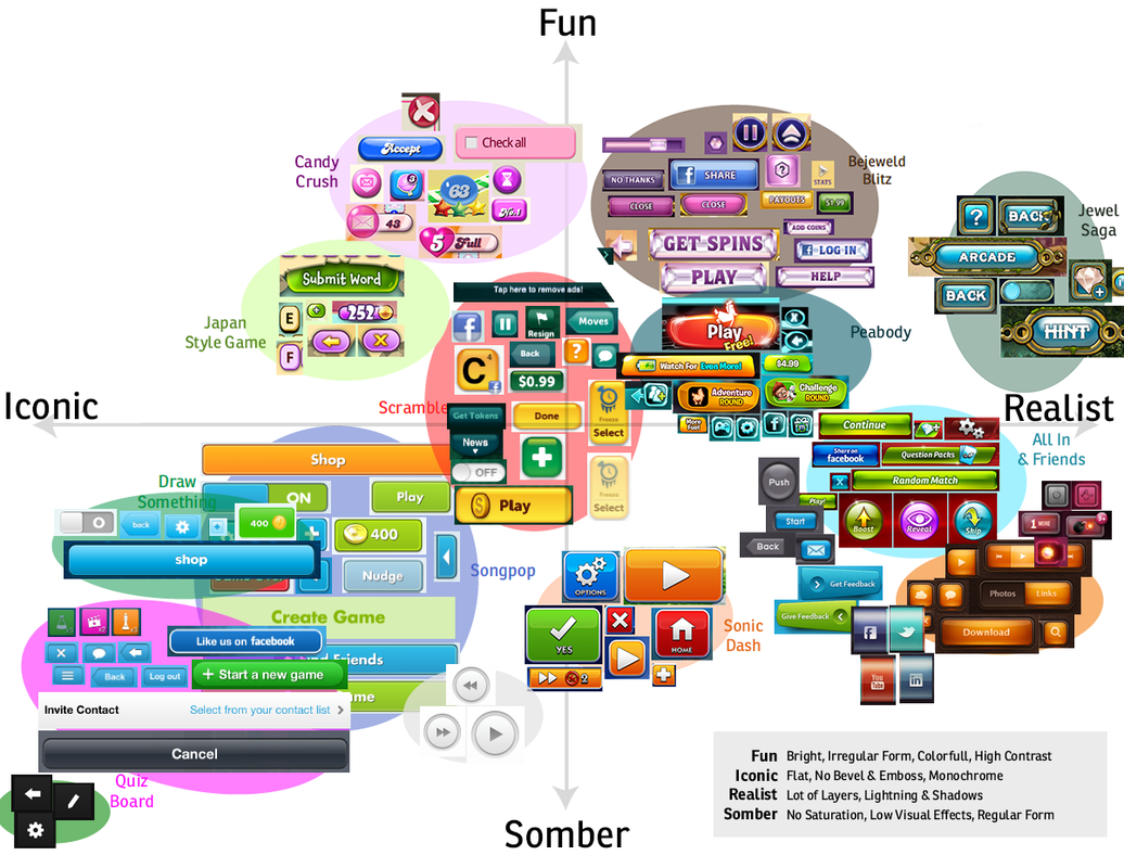
It's safe to say that so much of this is subjective, but you have to try to use your best judgement with these evaluations. Once you've defined and established the key words you're using to evaluate, you can start placing elements along the chart that can help you to start to identify the spectrum. It'll be hard at first but with the more examples you have, the faster you'll be able to really see the gradation you've established between "iconic" and "realistic." With your filled chart, you can then evaluate what you're looking at and pick a "Sweet Spot." The Sweet Spot, in the way that I'm defining it, is a circular spot area on the chart that you can say that you'd like your visuals to fall into. Within this area you can easily see other visuals that match the style that you're looking for. Using this, you should then come up with a definition for your sweet spot and what it means to be in it. This could be specific details about shape, color usage, and other identifying factors you'd like to include. This is definitely not the "end all" of establishing your visual target, but it should be helpful in defining pillars in your game for you and your artists to follow. Something else to consider... while you may spend a lot of time working on and defining who you are and what you're visual target is, it's also good to really consider who you're not. After you've established your Sweet Spot, defined it, and even have come up with examples of what it means to be in that area... spend some time actually making opposite pillars. i.e. Our buttons do not have realistic lighting, our buttons do not feel thick, etc. Coming up with examples and ways of identifying what isn't your visual target, is also a really good way of helping everyone see the direction your art is heading.
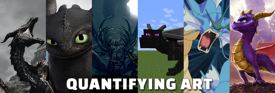
Once you've established a Key Value, in this example we'll be using Lovecraft, you'll want to identify where this Key Value is prevalent in other forms of media. Find movies, video games, comic books, and other forms of media that feature the same Key Value. If I was evaluating Lovecraft, I'd look to examples like Hellboy, the movie "The Mist," The Skyrim DLC - Dragonborn, Deadspace, the Amnesia games, etc. Look to these examples and search for commonalities among them. What makes this all feel like "Lovecraft."
"It's all about finding your Key Value, and defining the Elements that make up that Key Value." There are many other areas I'd like to cover but for the sake of this post and keeping things concise, I'll leave it with these few thoughts. Hopefully this was insightful and provides some strategies on ways of discussing art and how you might evaluate these types of things in the future. I may make a post soon that talks a little bit about Visual Priority and how to design visuals that makes it easy for your users to look where you'd like them to look. That's it for now though! Hopefully you enjoyed this post.
0 Comments
Leave a Reply. |
AuthorI make games, I play games... and sometimes I have some thoughts about that. 
Archives
March 2024
|


 RSS Feed